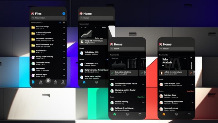
“These redesigns contribute to broader company efforts to take mobile productivity to the next level,” said Jon Friedman, head of Office design at Microsoft. The company has been conducting global research in preparation for the design switch, and one thing it has focused on is ‘microproductivity’. The idea is to increase the feeling of productivity by providing easy access to small, broken down tasks.
In Outlook, this takes the form of the recently announced read my emails feature, which lets you listen to your emails. For Word and Office Microsoft points to Read Aloud.
Evolving Fluent Design for Mobile
Microsoft is, of course, sticking with the decision to craft apps that have its own Fluent Design language, rather than that of Google or Apple on their respective platforms. “When designing Fluent for mobile, we focused on consistently designing seven signature elements to create a great end-to-end experience: the app icon, splash screen, cells, cards, typography, people, and file lists,” explained Friedman. “Now, tapping the app icon takes you to a branded splash screen, which leads to your content, neatly framed by a brand-colored header and a simple bottom bar featuring our brand-new, beautiful and friendly Fluent mobile icons ready to take action.” As users of the redesigns will have noticed, the changes aren’t drastically different, but they are cleaner and easier to understand, with faster access to collaborative tools. Microsoft’s mobile identity is only going to become more important when it releases the dual-screen Surface Duo next year. To aid cohesion across platforms Friendman and his team created a toolkit all designers can access. In the future, the team will be focusing on designing for more challenging scenarios, like 3D in Mixed Reality, as well as dual-screen devices.


